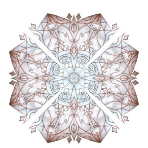
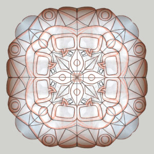
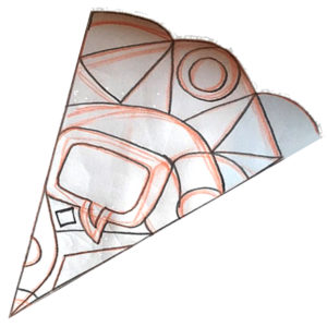
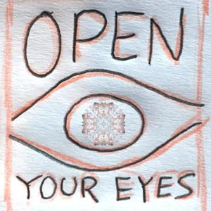
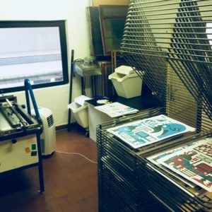
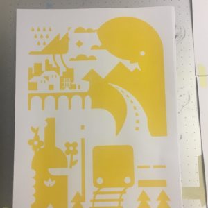
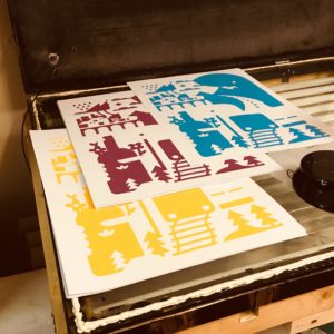
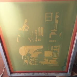
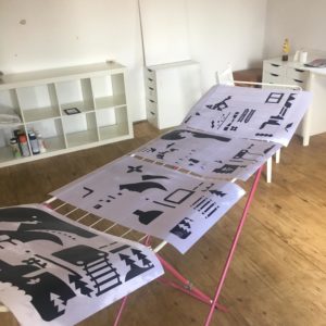
Havent done a time lapse in a bit, experimenting with surfer stuff and overlays for a new gig #illustration #design #timelapse
Author: RJ
Is The Man Who Is Tall Happy? Poster for Ted Rogers Hot Docs Cinema
Fun, challenging gig this week from Hot Docs Cinema in Toronto Canada. Make a poster for the animated Noam Chomsky documentary “Is the Man Who Is Tall Happy?”. Its a super stylized, psychedelic film directed and animated by Michel Gondry. It was a bit to wrap my head around at first but I found a way to make an original illustration that I feel pays tribute to the animation style and touches on some of the themes and conversation featured in the film. Thanks for looking 😉

Hot Docs Film Festival 2019
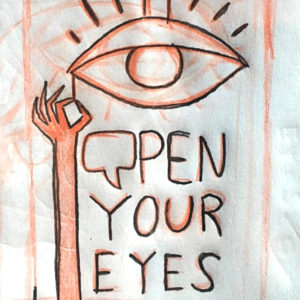
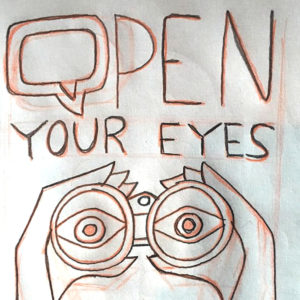
Another obvious direction was focus on the word eye. Maybe we could do something that used eye graphics or insinuated watching. Obviously, this was too obvious and the direction was scrapped. Thats a good thing though. I always feel like exploring a bad idea and being sure is better than not touching it and second guessing later if there might have been something there.
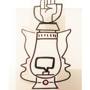
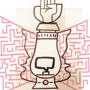
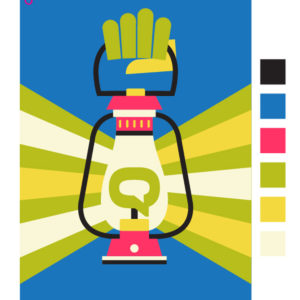
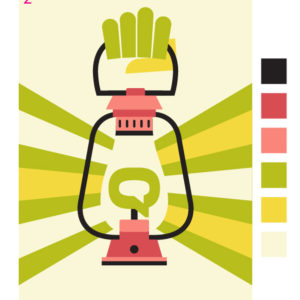
I was making some pretty complicated collage type illustrations (like I love to do) but one of the simpler pieces of a bigger image caught the eye of the festival team. I raised fist holding a lantern. The lantern supports on each side had two faces looking at each other, to imply conversation taking place. It spoke to the open your eyes idea with a leading the way kind of feel, and the closed hand also worked as a representation of a revolution.
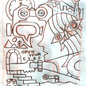
From there, we tried to think of different ways to handle the light rays coming off the lantern. Different patterns, hidden images, and even a few tries to bring back the kaleidoscope imagery.
We needed up dropping the taking faces aspect and making the first larger. We felt having too many pieces diluted the overall idea and the simpler, the better. Next was to start experimenting with colour and seeing where we could push thing while still staying on brand with the green and yellow.
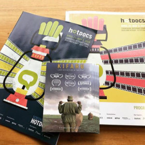
The festival team was pretty into all the colour experiments I did and end up going with the wild card idea of using all of them. I love wild card ideas. I made up a bunch of different posters with different schemes at the festival would mix and match them for different uses. Thinking that instead of plastering the whole city with the same image, if it changed up a bit maybe it would stand out more and get extra attention.
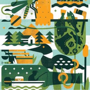
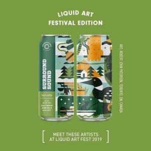
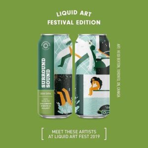
Surround Sound 4 Pack!
Me and some pals got to work with Collective Arts Brewing to make a four pack! We will also be doing some kind of live art thing June 14 and 15 at Liquid Art Fest in Hamilton. Our Surround Sound Four Pack should be in all LCBOs now
https://www.instagram.com/heidiberton/
https://www.instagram.com/jetpacksandrollerskates/
https://www.instagram.com/justinianlee/
VHS ReAnimated Posters
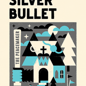
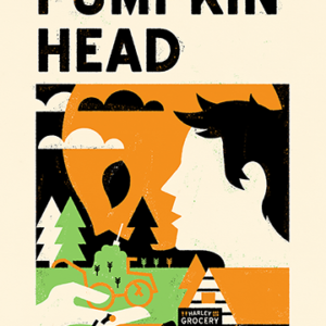
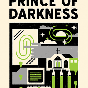
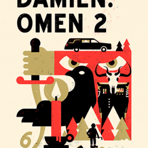
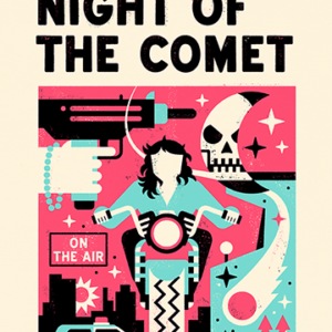
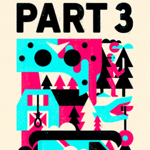
In my downtime between projects Ive been making weird youtube tribute videos called VHS ReAnimated where I talk about and recomend some 80s horror slashers that are either so bad they are good, or they are just regular good. Here are a few of the posters that I use in videos.
Asahi Christmas Card
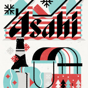
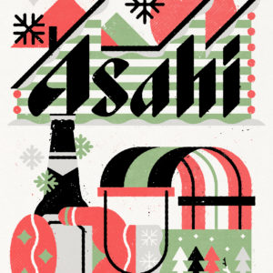
One of my last projects of 2018, what a fun one. Asahi really let me loose and do my thing with this one. Here are two colour schemes I sent, they went with the blue one
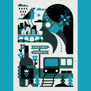
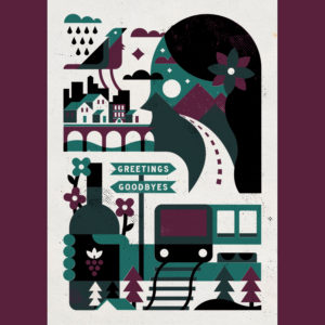
Greetings and Goodbyes
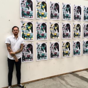
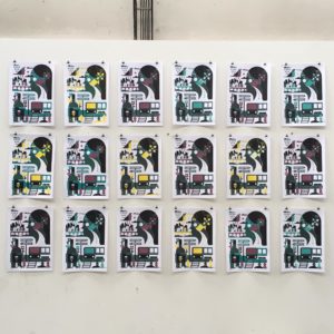
“Greetings and Goodbyes” is a poster series I created last summer at DEPO2015 in Pilsen Czech Republic. It’s a reflection and celebration of my last year traveling around Europe, meeting new people and really pushing myself out of my comfort zone. Not everything went as planned, but I don’t regret any risks or chances I took. Actually, all the stuff that went wrong make the best stories and inspire more art. So I guess I’m looking forward to the next time I get locked out, miss a flight, take a train to the wrong city, or you know… get banned from a whole continent
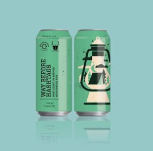
New Beer Can Collaboration with Collective Arts and Wild Beer Co.
Out now at an LCBO near you!
Happy to be apart of the summer release line-up along side awesome artists pals Jetpacks and Rollerskates and Natalieveryb illustration
Thank you Wild Beer Co. and Collective Arts Brewing
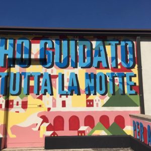
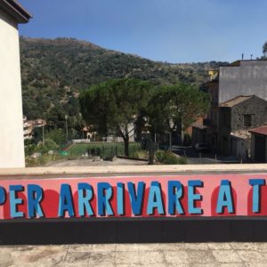
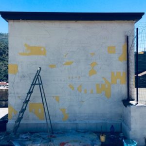
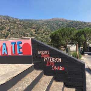
“Ho Guidato Tutta La Notte” – New Mural in Siciliy!! – Italy
“Ho Guidato Tutta La Notte”
Incredible month in Sicily, many many thanks to ART Project Graniti for hosting me.
Partially inspired by the song “I Drove All Night” by Roy Orbison, and partially a reaction to my time away from home. This painting is meant to be a reminder the most wonderful things in life are worth working hard for. Graniti is a beautiful town hidden away in the mountains, I would like people (locals and travellers) to see this piece and be reminded how special this place is. This is a painting about love, romance, anticipation and coming home.
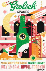
Grolsch Spaces Concert Series – Toronto
Just finished this poster for Grolsch Spaces at Rivoli July 19th. FREE ADMISSION and you get to see Wing Night: the band and Tongue Helmetaka win win (win)
