Street Art Toronto Electrical Box

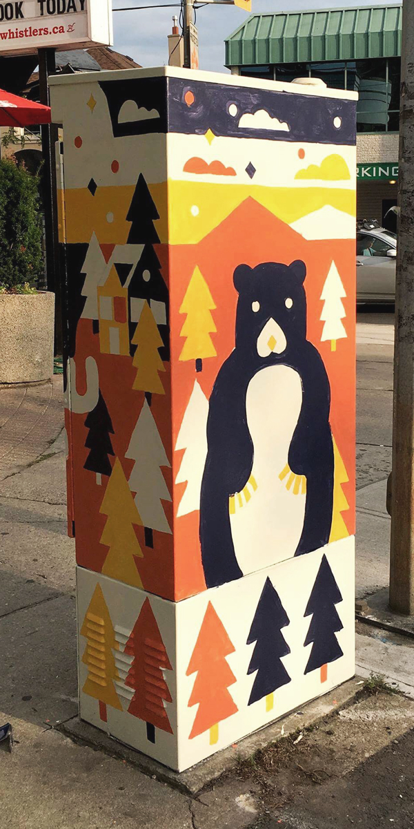
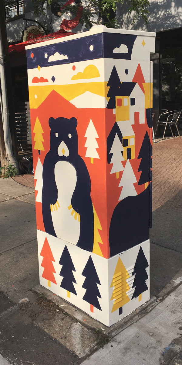
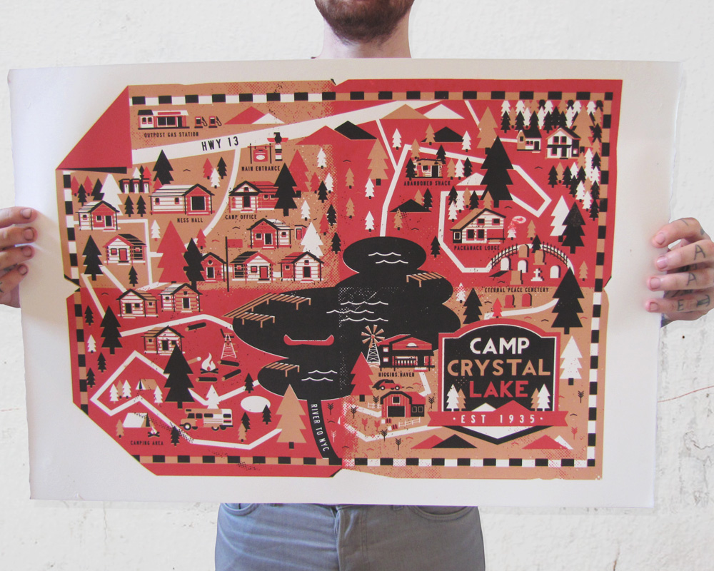
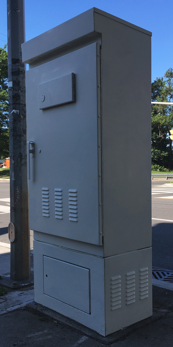
Street Art Toronto (or stART) commissions a couple dozen artist each year to paint a big ugly grey electrical box each, with the idea that it makes the city look nicer and it will cut down on vandalism. I was fortunate enough to be selected this year and decided to paint a few animals and sunset (classic)

I drew out my design in Adobe Illustrator then applied it to a template of the box so see how it would line up. I pretty much do everything in Illustrator. I love how I can create a figure or object out of basic shapes then move it around easily to build a composition

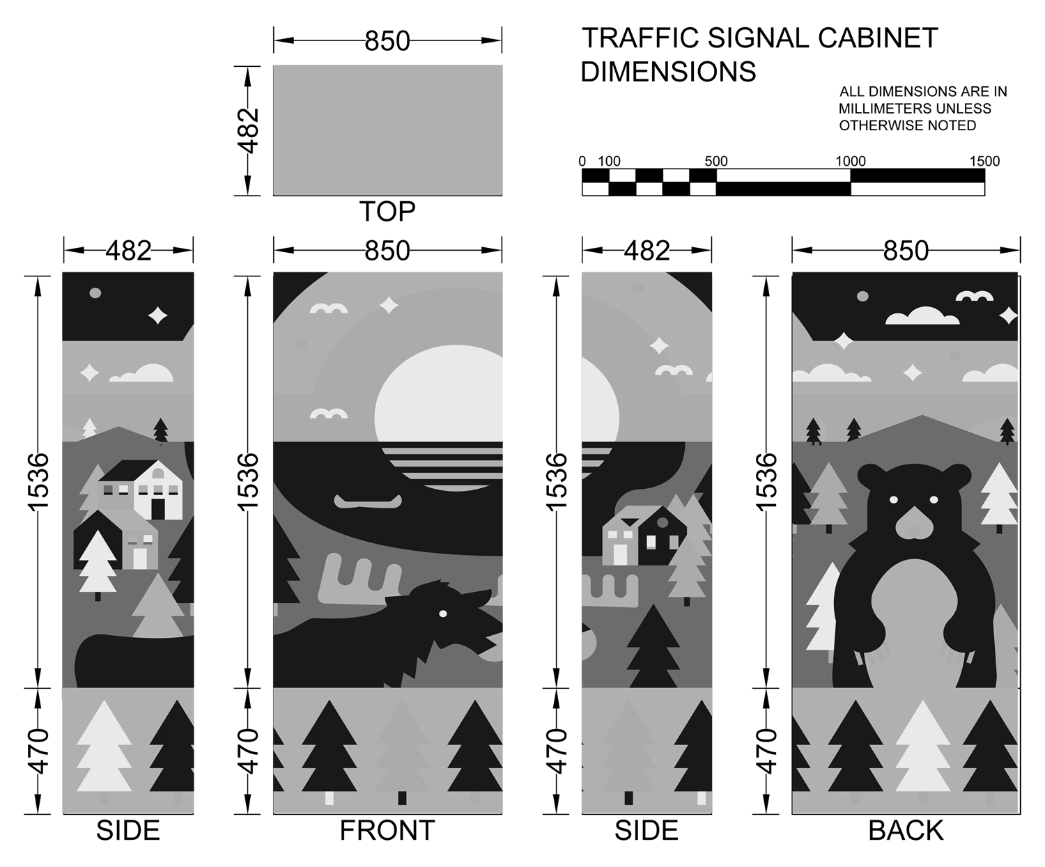
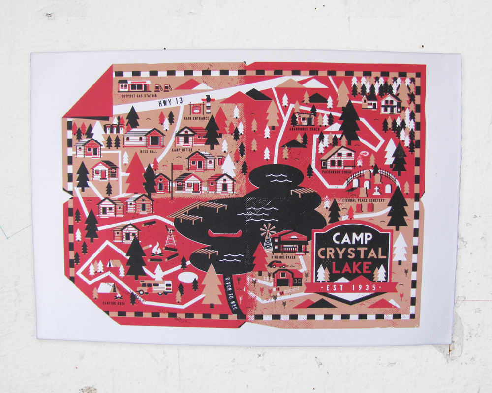
Final layout and colour rough of my design.

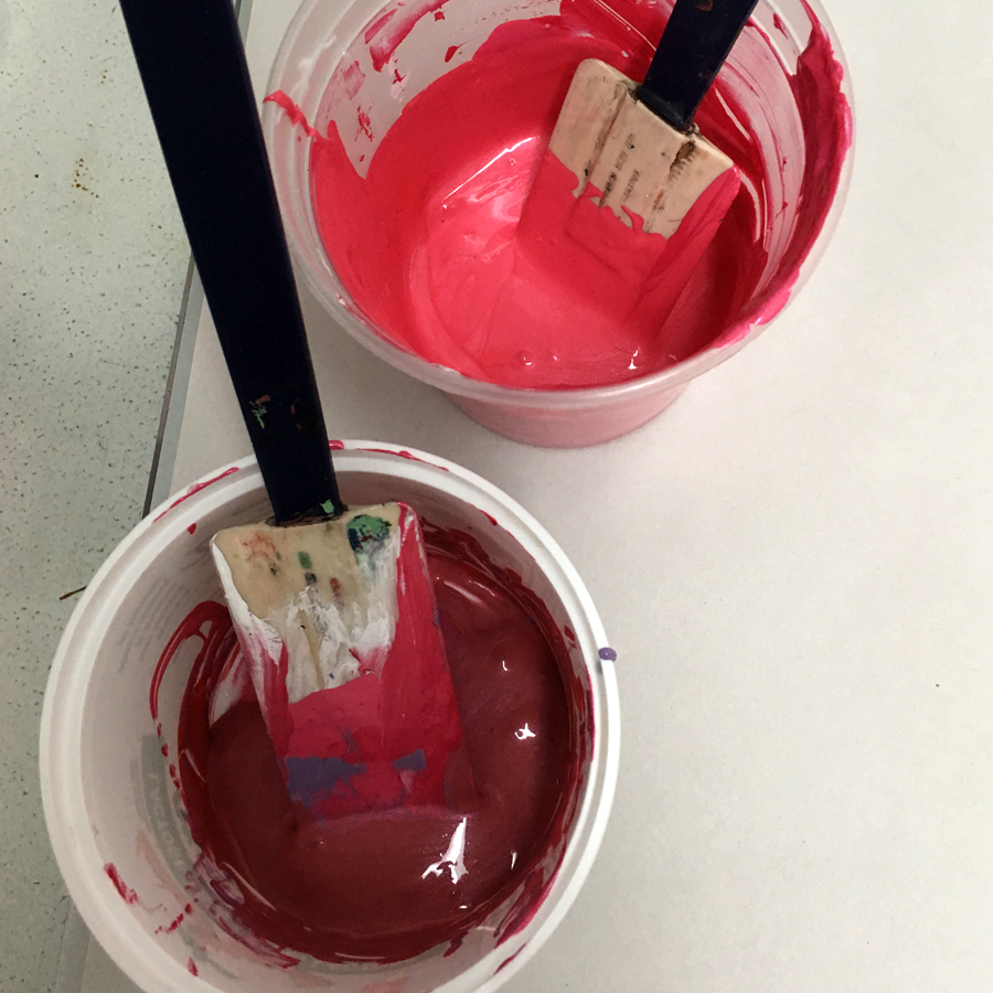
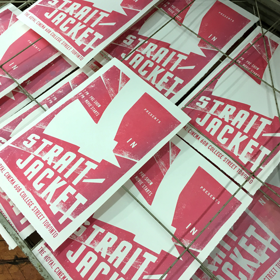
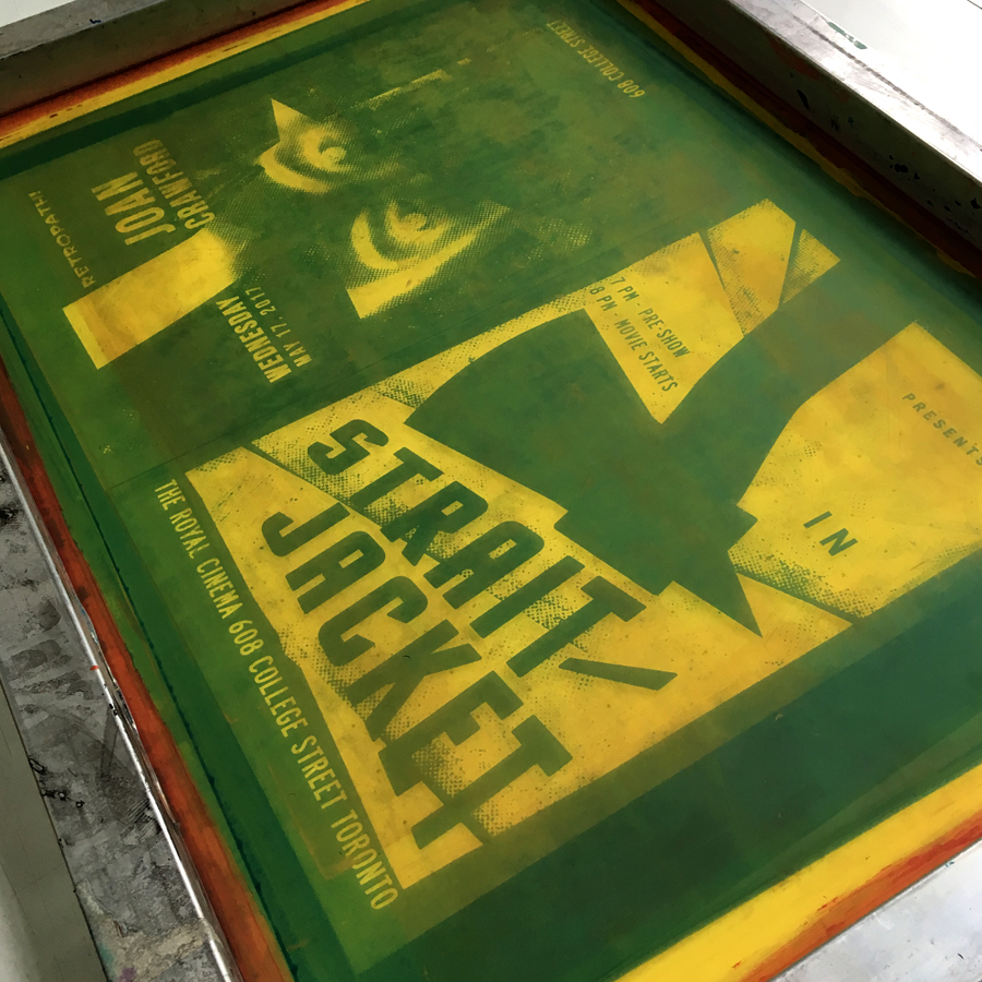
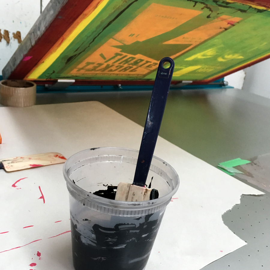
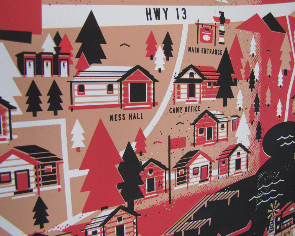
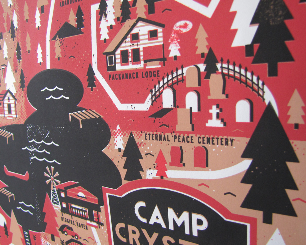
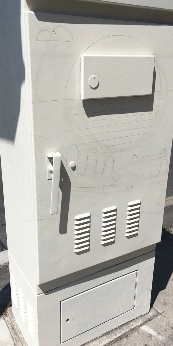
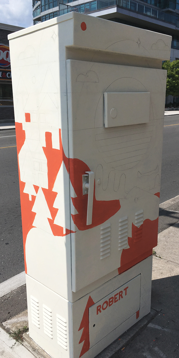
Step 1 was priming the box. It was in pretty rough shape so it took a few coats. Then I drew it out with pencil and started colouring it in, one colour at a time. Im used to screen printing so breaking down the image by layer is kind of second nature, and in this case worked out well.

Very happy with how it turned out, if you are in Toronto you can check it out at the corner of Broadview and Mortimer Ave

Here is a link to stART for more information on the application process if anyone is interested next year

Thanks for looking

ALL DAY BREAKFAST

Co-Curating an Event with the amazing Emily May Rose

Submission Deadline: June 30th, 2017
Opening Reception: July 6th
Show Duration: July 6th-18th

CALL FOR ARTISTS – Northern Contemporary is seeking artists and illustrators working in a range of mediums for a group exhibition running from July 6th – 18th; All Day Breakfast.

What is your morning ritual? Whether you’re an early riser or constantly hitting snooze, eating a full breakfast or relying on copious amounts of coffee, everyone has their own routine. All Day Breakfast takes an illustrative approach to exploring these habits and how different artists like to start their day. Do you opt for military efficiency, or can you hardly drag your ass out of bed? Show us what your morning looks like.

Eligibility: This call for artists is open to all artists regardless of location, international submissions are welcome. Painting, drawing, mixed media, and sculpture are all acceptable mediums. Keep in mind that Northern Contemporary focuses on illustrative, representational, urban, lowbrow, comic, pop art, and experimental work. 

Facebook Event Here

Retropath Presents: STRAIT-JACKET

Retropath is a monthly series at Toronto’s Royal Cinema – showcasing classic horror and genre films. I was commissioned to create the poster for Mays event, the screening of Joan Crawford as an ax-wielding ex-con in Strait-Jacket.

I knew from the get go I wanted to work with Joan’s eyes. Such striking, powerful eyes. I did a few thumbnails and came up with the idea of her face being super-imposed on an ax handle. If positioned correctly, the negative space beside her head would make the shape of the sharp blade.

Tried some new gradient slash two colours at once blending with the background. Its subtle, but Im super happy with how it turned out. For sure will find ways to incorporate it again into future work

Couldn’t be more happy with how the eyes fill the ax blade. In my sketch it looked like it could work, but the final result is much better than I originally imagined. The hair above her forehead reads like the handle, and even the hair on the side of Joan’s head looks like it could be a blood drip. The slightly offset layers add a bit of a shine on the edge of the blade too. All separate and seemingly unimportant elements, but when combined they create the effect I was hoping for.

Strait-Jacket, 11″x17″ Screen Print. Limited edition of 13

Check out process work for more projects on my Behance

Camp Crystal Lake Illustrated Map

Illustrated map for the iconic Campy Crystal Lake from the Friday the 13th film series.

Vintage looking hand made 3 colour screen printed illustrated map featuring locations referenced in the films. Paths around the camp double as a chalk outline of a body, with the lake in the middle representing a pool of blood. Perfect for you or a horror film buff you know!

All prints are signed, thanks for looking!

Prints available on Etsy NOW
https://www.etsy.com/ca/listing/524852849/camp-crystal-lake-map?ref=shop_home_feat_2

Animations!

Most people assume because I mainly use traditional print making techniques for my Illustrations that I am stickily an analog guy. NOT TRUE! I love animating using After Effects and bringing my work to life. Here is a collection of things Ive done in the last few months, I especially like the last one – it is a tech and style test for short film im working away on slowly. Really want to mimic traditional looking film grain and classic animation.

As always, thanks for looking!

Be sure to follow me on my other social medias to see more up to date work


HS Doc Club: Room Full of Spoons

hs-roomfullofspoons

In April the HS Doc Club is showing a documentary on the cult following of the so bad its good film The Room. The doc follows Rick Harper and his team on their journey across the globe as they experience this midnight movie phenomenon, meet with the entire cast and crew of the The Room and piece together the story behind its enigmatic director Tommy Wiseau.

My poster is based off the iconic (or infamous?) billboard Tommy Wiseau put up for over 5 years promoting the initial release of his film.

More info on the screening at HS Doc Club

Wild Rivers “Do Right” Single

Toronto folk band Wild Rivers reached out to me to work with them again, this time on an image for a new single they were aiming to release about a week later before they headed down to Texas for SXSW.

During our initial conversation, they had a rough demo to send and some lyrics, but were still in the studio so nothing was totally final. We talked about the inspiration of the song, and where they were as a band and kind of winded up on the road trip idea. Maybe it was the looming multi-day drive down to Austin on their minds, but the conversation kept turning back to the idea of the car ride on a long trip being just as important as the destination. Road trips are not a race, the long drive with your favorite people is the reason for the trip!

Sketches and colour roughs

wr-single-nomoon-021617

“Do Right”

HS Doc Club: The War Show

The War Show Robert John Paterson Illustration Design TorontoThis month the HS Doc Club is working with Hot Docs on the Ban This Series festival. It will feature free screenings with films based out of the seven nations currently banned from the US. The War Show follows a Syrian radio host and his friends as the country experiences a mass repression and revolution.

I wanted the image to be super obviously Syrian, so I started with the flag. I felt it was important for people to recognize where this film was from and what its subject was going to be based on. I then wrapped a radio in barbed wire to show both the war aspect as well as the main characters vocation. I didn’t start with the idea to restrict colours to solely the ones used in the flag, but as the image developed it became clear to me less was more, and to just let the type and flag speak for themselves.

More info on the screening at HS Doc Club

Intercontinental Wrestling Champion

Intercontinental Wrestling Champion John Paterson Illustration Design Toronto

To celebrate Northern Contemporary‘s One Year Anniversary, they reached out to a handful of artists that showed there previously and asked them to make something special. I took this as an opportunity to create something that Ive always wanted, a wrestling belt!

This started out much smaller in scope and less complicated than it eventually became, I wanted to do a screen printed series or possibly a collection of iconic wrestling titles. Then I got the idea to really try something new and instead drawing layers to print, draw the layers and have them laser cut on wood.

After I got all the pieces back from the laser guys (Hot Pop) I had the long task of organizing and layering the panels. The I got some old Pro Wrestling Illustrated Magazines and cut out every photo of an Intercontinental Champion I could find. I decided to focus on the ‘Continental Championship because as a kid it was my favourite and unleashes a somewhat unhealthy amount of nostalgia. In a way, taking on a month long project like this would only be doable for me if it was something I could get obsessive about. Anyways, after cutting out all the guys I collaged and glued everything together. I applied a few coats of slightly tinted clear coat to specific parts so when they are all assembled different areas would fall back on not compete with each other.

The version of the championship Im specifically paying tribute to is the Reggie Parks Intercontinental Title. Aside from a few design tweaks, this version was used from 1986-1999. While doing the collage phase, I made sure to only represent wrestlers than held the title between those years.

Ive done a few things similar, but this is by far the furthest Ive pushed the idea of a 3D or mutli-surfaced piece. I fully intend to do more stuff like it

Check out the event on FB Northern Contemporary One Year Anniversary Show